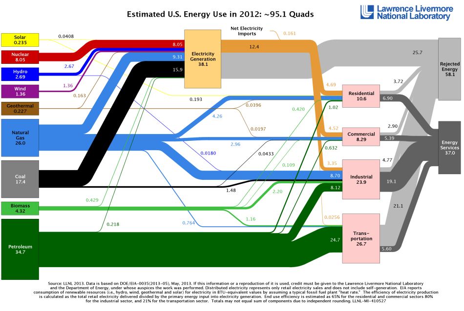
Those who visit my blog regularly know that I love charts and graphs. Below is a Sankey diagram produced by Lawrence Livermore Labs for the Department of Energy. Sankey diagrams are named after Irish Captain Matthew Henry Phineas Riall Sankey, who used this type of diagram in 1898 in a publication on the energy efficiency of a steam engine. The diagram below may also be viewed here.
In the diagram, sources of energy are on the left, uses of energy are on the right. The first remarkable thing that struck me is how much energy is “rejected.” Most of the petroleum used in transportation, and most of the fuel used to generate electricity, is rejected. A huge loss by inefficiency. Avoiding even a small amount of this inefficiency would in effect create a new source of energy.
Note also the small contributions of renewable energy sources — biomass, solar, hydro and wind — to the total. And the as-yet very small contribution of natural gas to the consumption of energy for transportation.