


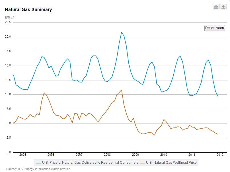
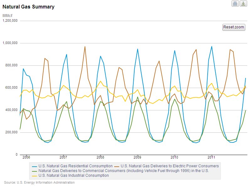
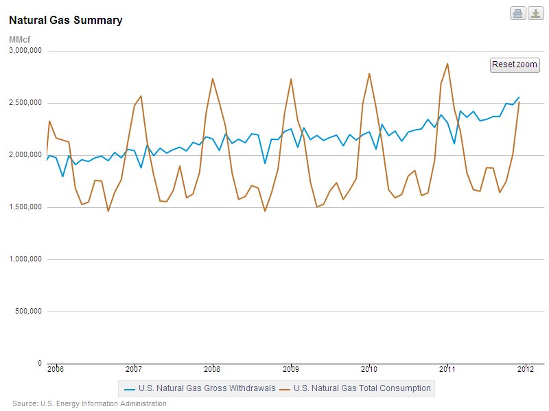
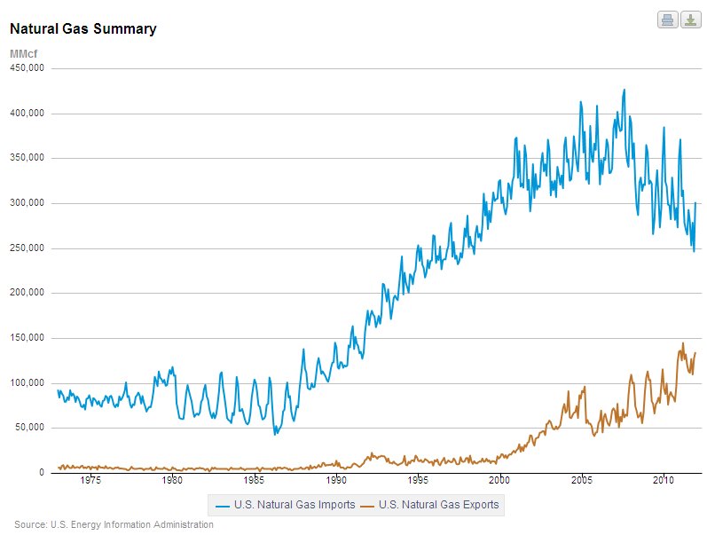
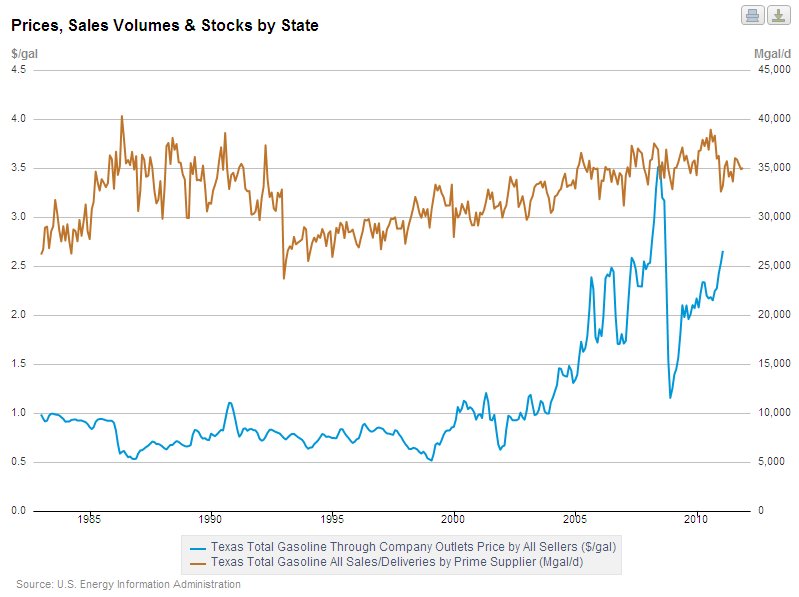
I love graphs. The Energy Information Administration, the guys that crunch numbers on all things energy-related, have come up with a new way to let us graph-lovers play with their data. The new interface is in its beta testing version, and you can play with it here. The site allows you to create your own graphs by selecting the data you want to depict. This allows you to compare two or more sets of data in graphic form. Here are some examples:
Try it for yourself. It’s fun, and you may learn something in the process.