


I have said before that I love graphs, and the Energy Information Administration has nifty interactive graphs of energy production and consumption. Here is one (click on image to enlarge):
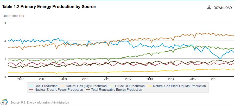 You can revise the graphs to cover any time period. For example:
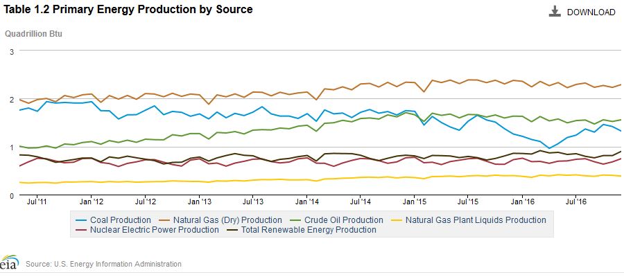 Here’s another interesting one:
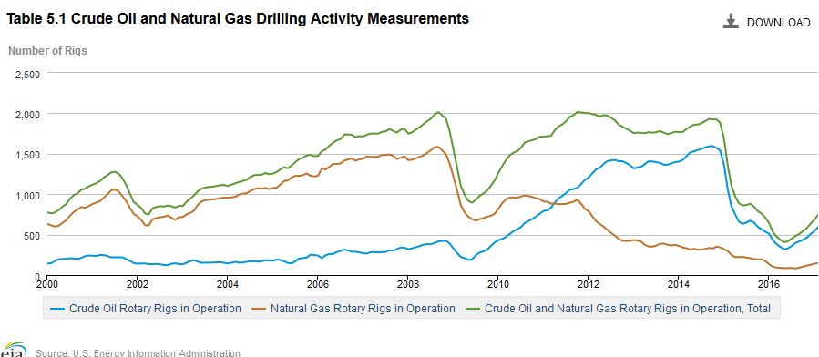
All the graphs and info can be viewed here.