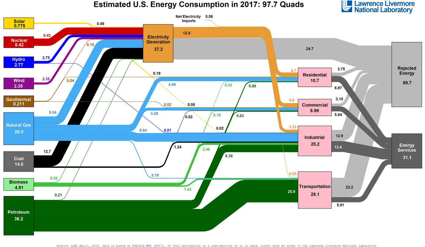
Here’s another flow diagram, from Lawrence Livermore National Laboratory, showing sources and uses of energy in the US, sent to me by a client. Note how much of our energy comes from fossil fuels – natural gas, coal and petroleum. We are addicted to hydrocarbons, and will be for some time. Recent changes in weather patterns reflect what is becoming more obvious – increased CO2 in the atmosphere is warming our planet. But how are we going to stop driving our cars, running our air conditioners, powering our computers? The problem with fossil fuels is that they are too efficient a source of energy. (click to enlarge)
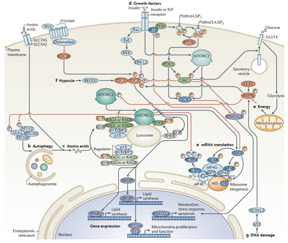
And here’s a diagram given me by my niece, who is studying biology. I can’t tell you anything about it except that it reflects the inner workings of a human cell. Things have certainly changed since I studied biology. Note the reference to “Energy” on the right side of the diagram, coming from glucose – sugar.